Tuesday, December 22, 2015

Upcoming Workshops

Paper crafting workshops
I can't believe that this year is almost over! I was going over my lists and I realized that a new year means new workshops are listed on the Copic website.  Lots of dates and locations are now listed.

New for 2016:
Coloring Flowers: Beyond the Book- This workshop includes some great images from the coloring flowers book, but also includes some new images. This class is taught on the same day, in the evening on any day that we are also offering a Standard Certification class.

Continuing from last year:
Standard Copic Certification: The ultimate class for paper crafters who want to know all the fundamentals of using Copic Markers. Learn how to test papers, inks, airbrush, and choose colors. Learn multiple blending techniques and experiment with a little mixed media.

Intermediate Certification: This class is perfect for people who have taken the Standard Certification class and now want to learn how to color more like an artist. Learn how to apply shadows and choose colors beyond the basics. Discuss composition ideas and how to color tricky situations and more complex images.

Whimsical Faces & Hair: Learn tips and tricks for coloring a variety of fun faces and hairstyles. Try many different color combinations and get ideas for adapting into your own stamp projects.

Vintage Values & Monotones: Have you ever wanted to color beautiful sepia images or in a limited color palette? This class is a great way to experiment with a variety of colors and techniques for beautiful images.

Dress for Success: Coloring Clothing & Accessories: From wrinkles to textures and patterns, this class will help you color many different fabrics and fabric styles. Leather, plaid, metal, and so much more!

Lots of exciting opportunities in 2016 to learn how to use Copic Markers. For more info about any class I've mentioned please visit the Copic workshop page on the website. 

Friday, December 11, 2015

Coloring a stylized poinsettia

Crisp layered colors
As I promised a few days ago, here is the colored step-by-step tutorial that I worked up for the free poinsettia download. I hope you enjoy coloring it your own way!

I printed my image on a piece of our Art pack paper. I always make laser prints or photocopies. (I know some of you ask about ink-jet printers, but sadly I don't have much experience with those, as I always work with toner).

I started with a light, even base coat of my lightest colors. I used R21 for the red and YG11 for the green leaves. I colored in circles, evenly soaking the paper so that my base color was nice and smooth. Then, I let this dry completely before I added my darker colors. This helps keep the color edges crisp.

Next I colored the green leaves. I wanted to work in a graphic style, not a realistic style. This is what I had in mind when I drew this whimsical, stylized poinsettia illustration.

 I used YG13 and YG17 to create the gradient on each leaf. I left the outer edge on each leaf light. I first feathered on YG13, then feathered a layer of YG17. The, I carefully blended the YG17 with a layer of YG13 and faded that out into the leaves with YG11.

If the base coat of ink isn't totally dry, then this technique doesn't work very well because the darker colors will bleed out and not be crisp enough. For darkest green areas, I added G28.

Same for the red. The base coat needs to be totally dry. Then, the red petals are much smaller and reds tend to bleed more, so I used a slightly different color order. I layered my dark R29 on each petal, then went back and blended out with R24 and R21. The center of each flower has a layer of R89.

This also prevents a build-up of too many layers of dark red. (On some papers that buildup turns into a sticky residue where the paper can't absorb any more.)

You can see the difference between the left flower, which has been blended, and the right flower which only has R29 and no blending yet.

I colored the flowerpot with Y00, Y13, Y21, and Y28. I layered and blended each of those colors. Then, I wanted to add some extra punches of contrast to the leaves and blossoms.

On the leaves, I added some very light streaks of R22 over the dark green area. I also added some light highlights of Y13 to the edges of the leaves. (See the close-up). It's hard to see that those are red streaks, unless you look really close.

Then, in the dark red I wanted to add hints of contrast as well, so I added tiny streaks of BG09. I know it seems strange, but the dark blue-green helps the reds pop-out more. Why did I use BG09? I really don't know. That was the marker my eye saw first in my stack of markers and I said to myself "Well, that color will work". Really, I could have used any dark blue or green or even purple to add pops of shadow color.

I finished the whole picture by adding a soft blue background. I used B00 and feathered it out towards the white of the paper. Usually I would come back with the colorless blender and blend it to make it fade, but the finished edges were so soft it worked fine without the need to blend. I colored right over all the black flourishes.

Then, I took the YG13 and colored in the flourishes. Since blue is found in green, there wasn't a problem of having a light blue base to the green areas. I added tiny bits of contrast to the larger flourishes with little dots of G28.

I hope you enjoyed this different, stylized look to my coloring. Now I have a pretty Christmas poinsettia to use for gifts.

Have a great weekend!

Wednesday, December 9, 2015

Free Poinsettia Line Art download

I can't believe it's December already! This year has really flown by. Anyways, this week I am working on a fun tutorial and I figured that I would share the line-art with you ahead of time, so you can experiment on your own, before you see how I color it.

This is my early Christmas gift to you. You are welcome to click and download and share this line art coloring page. I encourage you to color it, then display your finished creation around your house.

May you find some peaceful time during this hectic season to just sit down and color. Have a great week!

Wednesday, November 18, 2015

Add a simple background


Airbrushed mist
Today you'll get another quick tutorial from the demo last week. This time, I have a picture of a cheerful red robin, again, drawn from a photo taken by my friend Maaike.
Today I want to just show you a quick sample of the power of a background. Here you have the red robin before I added any color to the background.

I can't remember all the colors I used, but I know I worked heavily with the E40's family: E40, E42, E43, E44, E47, E49, and I warmed up the tones with an overlay of YR30 and Y21. I also used W1, W3, W5 and B91/B93 in the shadows. I also used YR12, YR14, YR18, and E09 in the feathers.

Next I need a background. He looks very sharp without one, but the picture looks incomplete. I also didn't want the background to overpower the foreground. 

So, I chose a very light E70 and W1 and drew in the suggestion of twigs in the background. Further away, I made them lighter.

 Then, I took the same pale yellow I used on his wing and lightly airbrushed the suggestion of a glowing sunrise or mist only along the bottom of the page. Nothing too strong, just a suggestion of color. 

Overall, I really like the feel of this bird, it's very different from what I usually make. 

I hope you have a fabulous Fall! Like this robin, just keep singing, no matter what life brings!

Monday, November 16, 2015

Coloring a kingfisher bird

Layering bird feathers
Last week I had the pleasure of coloring for two days straight at the U of O Bookstore. What fun I had! Any chance to sit and color is a win in my book.

Since I have been working on a new book, Coloring Birds with Copic Markers, you can guess that I have been focused on birds quite a bit recently. One of my dear Facebook friends, Maaike from the Netherlands, shared some beautiful bird photos from the Wildlife Refuge she works at, I knew I had to draw some of them. This kingfisher was my favorite from the whole event.  I drew him with a 0.1mm multiliner, then photocopied the outline onto some of our Art Paper.

(Just so you know, this is a way more complicated bird than the ones going into my next book. It took me a little over 2.5 hrs to draw and color in this vibrant kingfisher, whereas most of the coloring projects in my books are intended to be completed in about 25-40 min.)

I started by lightly blocking in the base tones. (I apologize in advance if I leave out any colors, as I didn't write down all the colors I used, so I'm going by memory). I used BG01, B24, B39, Y11, YR31, YR14, and YR18. Notice the light feathering strokes I used on the wing and chest.

The first spot you touch your marker nib down will be darkest, so pay attention to the affect you are trying to get, planning where your light and dark feathers will be. Sometimes I flick up the wing and other times I flick down on the wing. I try to always flick in the direction the feathers naturally grow though, so that it looks most natural.

Next, I went through section by section and darkened. I didn't have a great range of turquoise colors, so I had to build them by layering G43 and B24, frequently in feathering strokes.

 I darkened the head with thin lines of different blues. Then with the very tip of the brush nib, I added tiny rows of dots to the crown of his head, to simulate the fine striped feathers.

The beak was colored with C3, C7, C9, Y32 and a hint of YR14. I was careful to darken the orange area on the head, while keeping the white areas white.

At this point, I start really popping out the contrast and finishing details.

With B39 I added even more dots to the crest of head feathers. Notice I also punched out the contrast on the wing feathers with the B39 as well. I darkened the wing feathers in front as well with more 24 and a bit more green. BG13, BG18, B95, B9, V99 and many other colors.

This gave the feathers on the wing a bit more punch. At this point I let them dry throughly. Next, I took the finest tip of the colorless blender and carefully dotted in the white dot accents on the wing feathers. If the base color is still wet, then the dots will be soft and blurry, but by letting the base coat dry, then adding many layers of blender, letting it dry between layers, I was able to lighten up the dots.

Finally, I finished the bird by applying faint hints of Copic Opaque White. This popped out the contrast on the wing feathers and on his head-crest.

The branch is colored with layers of E11, E13, E15, E37, and E49. Then, I softly added some YG11 over some spots to suggest a green fuzz.

The moss is colored with YG01, YG03, YG13, YG67, and hints of G99.

 I faintly airbrushed a background using the chisel nib on a B02 marker, then added darker speckles of color with the brush nib on a B24. Then, I used the tip of the B24 and YR14 marker and added teeny-tiny dots carefully around the edges of the illustration, just because I thought it looked cool.


Monday, November 9, 2015

Upcoming Events

Free Demos, Workshops and more!
Fall is a busy time of year for me, and this year, as I've been working hard on my next few books, it has been extra busy. However, I have a lot of great local Copic events coming up in the next few weeks, so come and check out the stuff I've been working on. (After the new year, I'll list my demos around the country).

Nov. 11-12, U of O Bookstore, Eugene, OR 10am to 5pm
Free demos all day. I'll be downstairs at the bookstore, next to the marker rack, drawing all sorts of cool things.

Nov. 14-15, Eucon (Eugene Comic Con). Lane County Fairgrounds, Eugene OR
I'll be hosting a couple of workshops each day. For admission times and pricing, please visit the Eucon website. 

Nov. 21st, Demo at Collage  in Portland, OR (3701 SE Division St. location)
Free demo from 2-5pm. Come check out my new books and learn about Copic markers.

Upcoming Books
I think you'll be excited to know about my next two books, available in a few months. Intro to Coloring with Copic Markers and Coloring Cats & Dogs with Copic Markers. Both will be available after the first of the year.

About the dragonfly: I colored this dragonfly this weekend at a training session. I used a lot of very pale colors, E000, YG11, BV00, B91, Y00 but then I made them pop with hints of darker colors. YG13, E21, E25, V99, E31, BV23, Y13, and probably a few more colors I forgot to list. I drew the dragonfly based on a photo sent to me by my friend Maaike. The picture is colored on the Art Paper you can find here. 

Thursday, September 17, 2015

Coloring leaves with extra depth


Working with a limited color range
This weekend I was at an event and I had a chance to color one of the flowers coloring pages I drew this Summer. It really is a relaxing way to pass time, working on a larger project for a few hours.

I drew this image for our Coloring Flowers Line Art Pack. The images in our image packs are printed on the nice Art Paper we use in the Copic Sketchbooks.

Anyways, I was coloring on a folder on my lap, and I had only a limited color set with me. Even with few colors, I was still able to have a lot of fun coloring with depth. I wanted to share the power of having only a few greens and how you can add extra depth to your coloring.

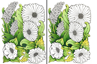
As you can see, these kinda large, goofy flowers have a lot of different foliage in them. But with a limited range of greens, how could I create more color variety?

I had only YG11, YG13, YG17, and G28 for my green families. So, I had to pull out my Y13 to add some additional brightness to the leaves up front.

Base color changes everything
The color you choose as a base makes a huge difference when you are working with layers of light colors. Evenly soak your base color by coloring in circles, using the side of the brush nib on your Sketch or Ciao marker.

If you look at the flower on the bottom left, it had a base of YG11, with yellow added on top. The flower on the right I colored in reverse, with the base of Y13, and the YG11 was added to the top. I shadowed each leaf with YG13 and hints of YG17.

I wanted to make a layered look, with the viewer being able to easily pick out the leaves in front, then the other leaves fading into the background a bit more. However, I still wanted the viewer to feel that the leaves were from different varieties of plants, even though I had limited colors.

Here is the rest of the leaf area, colored with only Y13, YG11, YG13, YG17, and darkest areas colored with G28.

Extra details
If you look closely at the side-by-side comparison, you'll notice some subtle finishing touches that add extra depth and interest to the image. the image on the right has extra layers of color around the edges and veins on the leaves. Basically, on each leaf, I took the color that is one step darker than the base color of that area and accented edges, veins, shadows, etc.

Here is a close up from the finished picture to show you what I mean. Look at how the extra green edges on the yellow leaves really accent them and make them more striking. (For the final area, I did end up needing to make my dark green area darker, but without another green, I ended up adding some faint hints of deep B39 into the shadows. )

I spent way too much time fussing over the leaves, probably 2-3 hrs on the leaves alone...except that I was at an event and constantly being interrupted to answer people's questions, so maybe it only took an hour or so of continuous time.

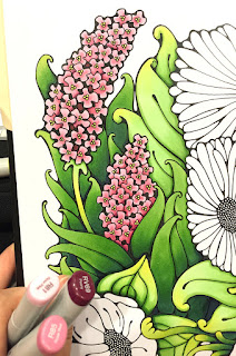
Then I moved on to coloring the rest of the flowers in the picture. Remember, I had only a few colors, so the pink flowers were colored with R81, R85, and RV69. The centers were colored with Y13.

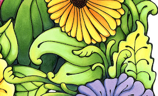
The two yellow flowers were colored with Y00, Y13, and YR14 and YR18 for the deep shadows (I used more YR14 and 18 on the darker yellow-orange flower).

The purple flower was colored with BV00 and BV04. The center is colored with RV09.

The top, coral-colored flower was colored with a base blend of YR14 and R21. If you look at the bottom image, you can see how the YR14 was flicked out from the center, about half way across the petals. The tips were left white. If they hadn't been left white then the R21 overlay would have been lost in the base orange.

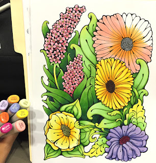
R21 was brought in from the tips and colored back into the darker YR14. To darken the shadows and edges of the petals on the coral flower, I used more layers of YR14 as well as YR18 and hints of RV69.

Overall, I love how different this came out than most of my other work. It was a lot of fun! Now, it will promptly find a happy place in my portfolio.


Tuesday, September 8, 2015

New Coloring Faces & Hair Book

Coloring Faces and Hair with Copic Markers
Hurray! I've been waiting a month or two for the main shipment of my new book to arrive. We just got our shipment from the printer and so finally, you can purchase your very own copy of the new Coloring Faces and Hair with Copic Markers book. This book is full color, 52 pages, of great information, and suggested price is only $9.95!

Coloring Faces & Hair book
Autographed Faces & Hair Book

I tried to fill this book with useful tips and tricks for anyone who is trying to color faces, skin tones, and a wide variety of hair styles. The back of the book has blank images and assorted color charts you can photocopy and practice right along with the tutorials.  Even if you've been using Copic markers for a while, I think you'll find some great stuff in here.


Book and Art Packs
Don't want to make photocopies of the artwork? Don't have the right paper to print on? You can also order kits which include pre-printed images and color charts. These kits are available for both he Faces and Hair book as well as the Coloring Flowers book.

Coloring Faces and Hair Book Kit
Coloring Flowers Book kit

The whole Coloring Foundations book series is intended for new users, as well as people who have some experience. Either way, once you finish the tutorial images in the books, you might be looking for more fun things to color with your Copic markers. Never fear! We have the perfect partner product:

Coloring Pages to match the books
Along with the books, there are matching Line Art packs, images that go along with the books but are full pages printed on high-quality marker paper. I drew these images in styles that match the art and tutorials found in the books. So, you get a wide variety of fun images, all 8.5" x 11" printed on high-quality marker paper, ready to be colored in.

Coloring People Line Art Pack
Coloring Flowers Line Art Pack


I'm so excited to see all these great products now available for purchase! (I nearly got a blister on my drawing finger from drawing all the artwork for these projects...there is a LOT of art for you to color. )

 Right now I am deep in the process of writing the next two books in the series, Intro to Coloring with Copic Markers and Coloring Cats and Dogs with Copic Markers. Look for those titles coming out in a couple months.

Thursday, September 3, 2015

Watercolor look


This morning I was working on a piece of art for a poster, and I was experimenting with the sky. I thought you might enjoy seeing a bit of the process.

Different papers give different looks
I wanted to get a very wet, watercolor look with my markers, so I decided to color a printout on inexpensive copier paper. (you can also color much faster on this paper as it uses so little ink). When you work with many layers of subtle colors on thin, soft paper it is much easier to move around.

I used C0, C1, C3, B41, BV000 and BV23 on the sky, along with colorless blender. (I lightly drew the cloud shapes in pencil so the lines ween't very dark). I added final highlights with Y00, then I used a LOT of blender. I used the chisel nib, as it was a great way to push and mush subtle colors together on large areas.

On thin paper, you need to be extra careful, as the color will want to keep spreading long after you are done, so around the edges of an area, you might find yourself going back with many light, careful layers of blender.

To show you how much blender I used, here is the backside of the paper. See how soft and washed together the colors are? That is due to the colorless blender.

The backside has a very different look, once you remove the dark black lines. (I really like it!!) However, for this project, I need a black and white version as well as the colored version, so I needed to run with the outlines.

For the rest of the ship, I streaked in colors like W1, E42, C1, C3, BV23, E44, E57 and E29. I used accent colors of R32 and R59. For the water I used B00, B34, B41, G24, BV23, BV000, and Y00.

Here is the final version, with all the yellow highlights and extra color added into the shadows. I think my client will really like this for the poster they need.

If you get a chance, experiment with soft, watery coloring and using colorless blender on a thin paper to see if you like the results. If you want your own antique sailing vessel to download and color, you can download one from our website here.

Monday, August 3, 2015

Coloring a stylized butterfly

A few months ago I had a chance to draw this really awesome butterfly. Drawing things like this is very meditative for me- I'm sure many of you can relate. It took many hours to draw, and I drew it with a 0.03mm multiliner on the Copic Art Paper (sketchbook paper).  If you would also like to color this exact butterfly, it is now available for download here on the Copic website, along with a few other doodles in a similar style. Check out our whole range of illustrations for download, since they're only $0.99 each.

Anyways, I was at a demo recently and I had a chance to color the butterfly. Although there are many many details, when you color it, you can choose to ignore most of those details, and have them just become part of the patterning.

I printed the butterfly on the Copic Art Paper  so it wouldn't bleed when I colored it in.

The technique I used for this entire image is feathering colors. I started with a light V12, feathered up, then I took a B66 and feathered down into the V12, and I went back and blended with the V12.

Then I feathered the B66 up, feathered a B04 down, then blended with the B04. I feathered the B04 up into B02, and that up into B00.

I repeated the process up along the top edge of the wings. Then, I went into each of the inner segments and repeated the same color scheme.

Once I'd finished those sections, I colored the main background of each wing with a feathered gradient from Y11 into YR65, and finally into R37.


Although the finished piece is a full sheet of paper, it was surprisingly quick and easy to color (I think it took about an hour, and I was demoing for customers as well). I love how vibrant the colors appear! the finished piece looks a lot more complicated than it really was.

The store that I was demoing at liked it so much, they asked if they could keep my colored piece. I was happy to share it with them, since it was so easy to color.


If you are looking for something a little different to work on, I encourage you to check out our full collection of downloadable coloring sheets and make your own fun artwork.

Have a relaxing week coloring!

Monday, July 20, 2015

Workshops and updates

Another week,  and I hope you had fun coloring with someone you love. I have some great workshops coming up that I thought I should share with you.

Free kids workshops in Oregon
July 29  - Downtown Eugene Library, Free Teen Workshop, Drawing Superheroes 2-4pm
July 30  - Bethel Branch, Eugene Library, Free Teen Workshop, Drawing Superheroes 2-4pm
July 31  - Sheldon Branch, Eugene Library, Free Teen Workshop, Drawing Superheroes 2-4pm

Aug. 1  - Kid's Create Eugene, Jordan Schnitzer Museum, 11-3pm
Aug. 4 - Springfield Library, Kids Drawing Comic Strips 1pm
Aug. 15 Art & Chalk Festival, Springfield, All Day - click here for more details


Then, I have some adult workshops coming up around the country in August

Aug. 8th Coloring Faces & Hair Book workshops, Main St. Stamping in Tigard, OR
Aug. 21, Coloring Flowers & Tracing Memories workshops, Boulder, CO - register here

Whew! A busy month ahead.

New Faces & Hair Book - coming soon
I am eagerly waiting for the first shipment of my new Faces & Hair book. It should arrive any day now. I'm excited, as I know it will have some great stuff in it for beginners who are trying to improve their coloring skills. I'll let you know when it is ready for sale. (this picture is one of the tutorials from the book)

So, last week I asked who you like coloring with, and I got so many wonderful comments. We randomly selected a winner: Terri!

terriavidreader (IN-USA) said...
I love coloring with my little granddaughter Dahlia. She's 4 1/2 and is so into crafting with grandma! It's fun to watch her start learning to color inside the lines and wanting to make a card!

Monday, July 13, 2015

Relax with a Coloring Party- giveaway

Coloring Is Relaxing
A few months ago, I had the pleasure of teaching a Tracing Memories/Coloring Photo Line Art class at my local library. What made this class different is that I actually got my Mom to attend.

A little backstory- My Mom has an art degree. She was an amazing oil painter, both portraits and landscapes, but she gave it up when I was very little because she had a house full of 6 kids and no room for painting. So, she shifted to self publishing quilting books as part of her creative outlet. She hasn't drawn or painted much in the intervening years. She always told me growing up, "Never get an art degree, you'll never make any money with it." I think that my family expected me to be a doctor or a lawyer or something like that (Not a chance!). Mom didn't really like my simplified, cartoony drawing style, and she just couldn't relate as well to my simplified, over-blended Copic illustrations.

Flash forward- Mom comes to my workshop where we are coloring a photo from a local park. It was a much more painterly, realistic style and it resonated with her. She got into it. She connected with a sweet family who took my class. And then, mom started her own relaxing coloring group at the local library. Mom would bring her markers, until the others built up their own collections. They would meet once a week to color whatever images struck their fancy: Mandalas, photos, manga...anything they found that they liked. They gabbed about life and family and whatever. It became the highlight of their week.

They had fun coloring. It brought peace and stress reduction to their life.

Look around you. Are you happier when coloring? Are you in the zone? Do you feel the peace that comes when you tone out the world around you and color what you love?

Have you seen all the articles in the news recently about how popular coloring is, and how good it is for your health? Coloring is Awesome!

I really want to hear your coloring story. 
What motivates you to color? Is it to cope with the loss of a loved one? Is it because you can squeeze it in on long road trips? Is it because you remember coloring with your grandma when you were little?

Please send me an email with YOUR coloring story and maybe a couple photos. I will choose some stories here and there and share them with others for inspiration (Don't worry, I'll let you know if your story is chosen).

(This photo is from a class I taught at a local assisted living facility a couple years ago.)


Host a coloring party
If you've felt that relaxation that comes from coloring, then I challenge you with this- have you gone out of your way to spread that happiness with others? Have you invited someone over to color with you? Someone who has never tried coloring before?

This Summer, take a moment and color with someone who needs a break. It could be a stressed out co-worker, a friend in an assisted living center, a child or an aging parent. Just block out some time and color!

Giveaway
Please leave a comment on this post, tell us who you love coloring with or who you want to color with, for a chance to win a copy of my Coloring Flowers book + a selection of flowers line art printed on our specialty marker paper.

 My goal is to encourage people to relax, and more than that, help someone else relax. One thing this busy world needs more of is simple relaxation. Go back to your happy coloring place and bring someone with you.

I will choose a winner on Friday.

Thanks and have a colorful week!!

Monday, June 29, 2015

Plein Air & Chalk Festival, Aug. 15th

If you live near Eugene/Springfield, OR, and you love creating art outdoors, then we have a great opportunity for you! Join our Plein Air and Chalk Festival on August 15th, sponsored by Imagination International, Inc. (that's us). Cash Prizes!

Visit the registration site for more details.

Last year, I participated in the chalk drawing portion, and had a blast drawing my whimsical pirate! I've never participated in a chalk drawing event before, since markers are my main art medium. It was a wonderful challenge.

There were lots of people who stopped by to see the great artwork being generated. It was so much fun to see families and friends wandering by to better understand the process that artists go through. So even if you aren't participating as an artist, please come and see what excitement is going on. This year is even better, since artists will be allowed to draw, paint, or create all over the downtown Springfield area.

So, please join us for this fun summer event!

Saturday, June 13, 2015

Coloring flowers book signing today

Today I will be teaching workshops at Main Street Stamping in Tigard, OR. All my classes are from my new book, Coloring Flowers with Copic Markers. If you would like to come pick up an autographed copy of the book, stop by from 4-5pm. I can't wait to see you there!

Thursday, June 4, 2015

Coloring a flower girl

Little Flower Girl
Last week I had the pleasure of coloring all afternoon at a demo. It's so relaxing to just sit and color. sigh. I wish life gave us all more opportunities to just sit and color. Can you imagine how much nicer everyone would be if they spent an hour each day coloring?

Anyways, while I was at the demo I colored this flower image you can download from the Copic website.  Many of the flower images I drew to match tutorials found in the Coloring Flowers with Copic book we sell.

This picture I drew for our website to match the 4th project in the book, so, in the book you learn how to color this style of flower, using palette blending for the dark colors. While coloring at the demo, I only took step-by-step photos of coloring the girl because the flowers are discussed in the book.

Even though this picture is simple, I tried to keep my shadows consistent on the little girl, with the sunlight hitting her face strongest. The flowers are more of a design element, so I just colored those in, without much worry over shadows, except a little bit on the leaves.

I started by coloring her dress with a base of R81, and added shading with R85. I knew that the hearts would be a darker purple, so I just colored right over the pattern and didn't stress about coloring around them. The darker purple is V06, with shadows of RV69. Notice how I left a lighter highlight on the back of the dress, along with the stronger highlight on the front. This makes the shading stand out more. Be careful not to blend out all your contrast, or your work will look too flat. High contrast makes art more interesting to look at.

I colored her skin with E00, E21 then added shadows with E13. I added light layers of  B00, R30, and a hint of R31 to change the tone. Her basket was colored with E31, E35, and R39.

Then I worked on coloring the flowers. The yellow flowers are colored with Y32, YR65, and R05. Centers are E35. The pink flowers are R81, R85, R39, and centers are RV69.

Leaves are YG11, and YG17 (notice how much contrast I use in my greens, I jump straight from YG11 to YG17. It makes them more vibrant). I darkened the deepest leaf shadows with G28.

I finished with a pale B00 sky background that I faded out to the white of the paper using the Colorless blender.

I had such a relaxing time coloring this picture. It took about 2.5 hrs to color, since it is a full sheet of paper and I was also helping customers during that time. Coloring all those little flowers kept my hands busy while my mind wandered. I ended up staying at the demo an extra hour or so because I was having so much fun coloring!

(I'm sure none of you have ever stayed up too late coloring because you were "in the zone".)

I'll be sure to post some more tutorials, even though I am super busy writing my next two books. Have a great weekend!


Wednesday, May 27, 2015

Coloring a knight in armor

Shiny Metal
A few weeks ago I was at a demo up in Winnipeg, Alberta. I had a chance to make a quick sketch of a knight and color it in the second day of their open house event. I don't remember exactly what colors I used, but I will try and guess as I show you a few step-by-step pictures.

I drew this guy with a 0.05mm multiliner onto Copic Alcohol Marker Pad paper. Then, I photocopied my outlines onto the new Art Paper Pack paper (Copic Sketchbook paper).

I began coloring his blue surcoat. I think I used B000, B32, B45, BV13, Y00, and maybe a couple others. Notice how I left the highlights on each wrinkle a clean, crisp white. This enhances the shadows and adds a nice contrast on a fabric that is supposed to appear pale.

Then I moved onto his reflective metal. Notice the strong contrast, the bright whites that I left, right next to the dark grays. I used a wide range of the cool gray markers, then added highlights of Y00, and extra shadows with B000.

I can't remember what colors I used on the back of the shield, but I gradually built up colors and contrast until I got the look I wanted.

Notice the light sketch suggesting a background. I didn't want hard lines to define the background or foreground, as I wanted to keep the knight the most important/highest contrast  object in the picture.

I kept working around his image, darkening the chain mail with the same cool grays I used on the shinier metal areas.

On his arm bands, I wanted a different feel. I honestly don't remember what material I was trying to achieve, just something kinda dusty so it didn't conflict with the other metal in his ensemble. The leather straps were closed with a range of E11, E13, E15, E18, and some grays.

Again, notice how I left strong contrast on the metal sword, but included faint highlights of pale yellow to enhance the white areas.

Here is a quick photo of the final image. I colored the cape with R24, R29, R59, Y00, and B39.

To simulate depth of field in the illustration, I kept my highest contrast on grass and shrubs in the foreground, with details and color range getting lost as it heads off into the distance. I finished up with highlights of Opaque White on many of the metal objects.

Overall, I liked this more when I was drawing and coloring it, but now that I look at it a month later, it's hard for me not to see the flaws. (We tend to be our own worst critics sometimes)

If you are working on a piece of art, don't get hung up on the flaws! Just try next time to do it better. I know what I want to change next time I draw a knight. However, the parts I really like are the colors on the surcoat and cape. I also like how I colored the helmet and steel boots.

Meanwhile, don't forget to come visit me at my free book signing events for my Coloring Flowers book!

Friday, May 29, 1-4pm, U of O Bookstore, Eugene OR
Saturday, June 13, 4-5pm, Main Street Stamping, Tigard OR