Friday, February 27, 2009

Happy Birthday to Me!

Today's my birthday, and I want to send a big thank you to everyone who has already left comments or sent me digital birthday cards. There are some cute cards out there! I figured I haven't shown a basic tutorial in a long time, so here's a great birthday coloring exercise. Someone asked me about this a while ago and now I'm finally showing a tutorial.

Coloring Transparent Balloons
If this is the first time you've tried to layer really different colors I suggest you work with light colors or pastels. Today I'm using a pale blue, pink, and purple BV00/BV04, B21, and RV11. I quickly drew this bunch of balloons and photocopied it so I could

Begin with the front balloons. Transparent things collect color at the edges, so color darkest at the edge and feather into the middle. Do this for both front balloons. As you can see on the blue balloon, I am using the side of the super brush nib and stroking in towards the middle. This leaves the center almost white and the edges will bleed through on the backside.

Next, take your colorless blender and push the color back out from the middle of each balloon and let it gather at the edges. This heightens the effect of transparency. Want more transparent balloons? use more blender. You can let it dry and then push it again if it's still not light enough. On some cardstocks you need to be careful that you don't oversoak the paper or else it will start feathering. For darker balloons use less blender, or a darker color.

Now you can add the color to your back balloon. Start by coloring just the area not covered by the front balloons. I started with BV00, added BV04, and went back over it with BV00 to blend the colors better.

With the BV00, add a dab of color inside the other two balloons. Don't color all the way up to the dark edge, just feather the light color up to the edge. Add a tiny dab of BV04 to the extreme edge of the layered balloon. Add more BV00 to fade this in as well. The covered areas should NOT be as dark as the un-covered areas, and you still should see tones of the front balloons.

The lighter you make the layered areas in comparison to the un-layered areas will determine how transparent the front balloons are. If you want the front ballons to be pale but not very see-through, then add only tiny hints of purple. If you want the front balloons to be pale and very transparent then make the purple of hte back balloon closer to it's regular color.

Now, go back with your RV11 and B21 and darken up the front balloons in the same way you first colored them. Feather in from the edge towards the middle. It's OK to cover up the purple areas of the back balloon because it softens the dark purple and looks more like you're looking through the balloons. It looks pretty beleivable at this point. Again, if you want the front balloons to look less see-through then layer more of the original color and wash out the back color more.

For the final touch, I took Opaque White and added glints of light to the top to make the balloons appear shiny.

I hope each of you has a great weekend. I'm going to try and catch up on my e-mails and artwork that I am so far behind on. Eat something sweet- I know I will!
Thursday, February 26, 2009

Certifiction and Setting up in-store events

What a long, great trip! I met so many fabulous people this weekend and had a great time. Somewhere between Mardi Gras and northern Florida I picked up a cold, which was not helped by flying, so I have been a little behind in my posting. However, I have some class info to go over today before I post a tutorial tomorrow.

Certification, Spring 09
First of all, we had some technical difficulties on the applications I had all ready to go before I left town, so I apologize for everyone trying to get into April and May classes. Those will be going out as soon as I can fix the auto applications. Please do not bug us for applications if you have already asked to be on a mailing list or signed up through our sidebar. The applications are on the way, trust me.

New Certification Location- Winnepeg, Manitoba, Canada
Sherrie Siemens has just arranged a new Canadian location for Winnepeg, June 6th. I will be doing a mailing next week for that class, so if you are in Central Canada or the Northern part of Minnesota or North Dakota this is a great opportunity for you. Again, you can sign up via the registration form on my sidebar.

Certi-fiction
We have also had some questions arise about what a certification class will help you with and why it is open first to Store Owners, Teachers, and Design Team Members. Here in a nutshell are some ideas of what to do after you take a Copic Certification class in papercrafting.

After you are Certified...
Once you are Copic Certified you get a lovely little certificate to hang on your wall and you can say you're certified on your blog. Now you need to practice, practice, practice. What else do you get from attending the class?

What you Can do:
• Listed on our online Instructor list- this is located on the Copic Website under Instructors. It is currently being updated, so if your name is not on the list and you took a class after November, don't worry. Soon you can expect it to be updated within 2-3 weeks after each certification class, tough there are a lot of certification classes taking place this spring so please be patient.

• Offer in-store demos- ask your local stamp store if they would like you to do a demo or make-n-take. You need to provide all your own product supplies and make 'n take parts, though we are happy to offer literature and support materials. Please allow 2-3 weeks shipping if you request literature.

• Teach a papercrafting class- Take the techniques you learn and turn them into a workshop. You can print off any posts from this blog as instructional material, though you need to credit where the info came from. Again, if you need literature, just let us know with adavace warning and we'll be happy to help.

If you are teaching a class and you will need markers please remember: Copic markers are in very high-demand and you will want to place your order at least 60 days (preferrably 90 days if the colors are very specific) before your workshop especially if you order direct through Copic. Don't set up a class before you have product arranged- this will just make people unhappy. Ditto for stores trying to set up a Copic Club. Please have product before you hype an event.

• Peace of mind- You'll know that you heard information about Copics straight from our official representatives. If you ever have a question or problem just bug one of us and we either find the answer or take it straight to the manufacturer in Japan.

• Blog - Go ahead and share anything you learned in the class on your blog. Just cite where you learned the technique from if it is unusual or if others might have questions. If you have a blog and are certified and need the logo send me an e-mail with the city you were certified in and I will be happy to send that to you.

• Get asked by other people to teach - Occasionally we have a need for a demo or workshop across the country. We may contact you or another store might contact you. For this reason, be sure that your blog shows good, high-quality use of Copic products so that if someone comes looking for your services they'll know what kinds of things you make.

Use the status to get on design teams - I know that it means a lot to some design teams if one of their candidates is Copic Certified, however, you still need to prove though high-quality work that you know what you learned and to get them to pick you.

What you can't do:
• Get Frustrated. If you're certified you still need to practice, it won't magically work the first time. Those of you who have taken the class know what I mean. Some of the blending techniques are tricky and you might not have mastered them during the class. Just keep practicing and you will improve. This is why you can re-take the class. We know you won't get it all the first time.

• Certify others. Sorry, to be able to certify others is a long, involved process and we are NOT looking for new instructors at this time. You can teach local classes but nott official Copic Certification classes.

As you can see, Certification is geared for people who plan on going and sharing what they have learned with others via store, classes, or online through their blog. We want everyone to be able to have access to high-quality Copic classes, even if they can't attend a certification themselves. If anyone takes a class from someone who is certified and has a good experience, please contact us. Likewise, if you have a bad experience please let us know why and how they can improve.

I hope this helps you understand the process a little better. We want everyone to be happy with their product knowledge and we'are always looking for ways to improve our education events. In 2009 and 2010 we hope to visit many more cities and offer classes in places that have not had them before. Have patience! It may take a while to come to your region, but know that we still love you.

Sunday, February 22, 2009

I'm Still Here

I am still here, I've just been busy with so many fabulous papercrafters. Friday we had a great certification, despite Mardi Gras delays and traffic. Sunday we had a wonderful class at Flourishes. I discussed the last post in-depth, so we covered elements of layout AND we discussed color theory and the weight of colors.

Although I'm not showing much today, I want to direct you to a fabulous website that allows you to type in a word and find color scheme related to it, or you can take a color you have and look at color combinations based on that color. Go look and play- it will help you get color ideas to break out of a rut.

You need to have a recent version of Flash Player, but it't totally worth it. Enjoy this until I get back in town and post some more stuff. Have a great week!

http://kuler.adobe.com/

Thursday, February 19, 2009

Basic Rules of Good Design

I'm here in lovely New Orleans, getting ready for my class tomorrow. As I am waiting for the blog to move I'll post some more things without supporting artwork or diagrams. I posted this to a group of stampers on SCS, but as I mention, I learned these rules of good composition as a graphic designer for newspaper layouts. I need to give credit to my 9th grade journalism teacher Mrs. Bigham if anything...These rules of thumb got me through design school and my journalism minor and I have yet to find anything as simple or concise when thinking of layout.

Anyways, I hope this helps you as you think of composition and how the parts make up the whole. It really has little to do with Copic, and more to do with good design. Eventually I will take each point and expand on it with artwork. Again, sorry I am directing this at stampers, but it is a key element of any creative composition- not just cardmaking.

A Summary of Good Design
To understand why you can instantly recognize a good card design yet you have no idea how to get there yourself you need to check out a book or two from the library on basic graphic design and layout. Our eyes and mind see it, but without RECOGNIZING what the good elements are we will never be able to re-produce it.

In my high school journalism class I was the graphic designer and in charge of making the whole paper look good. I would train each new batch of students on the elements of good design. We had a formulae that has never failed me, and it can be applied to both graphic design and fine art as well as in cardmaking: DUMB-V

First, Hold your card at arm's length and squint at it. Then you see the parts, not the details. Then go over each element of good design

D: Design. or overall design, format, size- the technical stuff

U: Unity. Do all the parts go together, not always match, but at least go together? This is why we care so much about color and patterns.

M: Movement. What is the first element that catches your eye? then where does your eye go from there? do you get lost and it all blends together? if the flow is wrong or the main thing doesn't stand out then it's poorly designed. Ribbon or stripes pull your eye in the direction they travel, so a ribbon should be strategically placed so that it pulls the eye into your most important element (then people tie a bow to really give a focal point).

Sentiments are read from left to right, so your eye naturally travels from left to right. when it reaches the right, it should be pulled back into the top of the card somehow, and from there, back into the middle, or in an endless loop. This makes you look longer at the card, and if you spent an hour making it you darn well want someone to look at it longer than 5 seconds!!
(see V.)

In scrapbooking, this is why you don't want your photos looking off the page, people follow the direction of eyes and if the eyes look right off the page then you lose your audience. Same with stamps of things that have eyes. If the art is looking in a direction, then try putting your sentiment in that direction. In a composition, the stamp is looking at something within itself.

Take for instance, the Hanna stamp where she is placing a star on top of a christmas tree. Hanna is looking at the star, her arm is out holding the star, then if you put the tree under her hand you have a loop Hanna, Arm, Star, tree, back to hanna. If you have no tree, then put your sentiment near the star, then your hanna pulls you into the sentiment. No tree, then you have one other element down in the empty space under the sentiment and next to hanna to balance the image. Don't make the last element too big or contrasty, this upsets the balance:

B: Balance. Each color, each bling, each patterned paper has a visual weight. Dark things are heavier than light. Contrasty patterns are stronger and heavier than subtle patterns. Your most important element usually stands out because it has the most contrast. When you add a ribbon that is the same color as your background paper the ribbon is lost because it has no weight of it's own. Too many high contrast papers and your image gets muddy and unbalanced. Start simple- one solid, one pattern, one bling or punch and one stamped image/sentiment. see how these work with each other. Bling, like a big ole sparkly something thrown on, will have a lot of weight- like a black hole it sucks your attention in and then you loose the important part of the card. That's why the little rows of tiny blings look so much better than one big, horking rhinestone.

In design, classy things are visually stable, conveying long lasting. So a classy sympathy card should be heavy on the bottom, since it's visually more stable. A fun, whimsical card can be light and airy, but slightly top heavy. Trendy, urban things tend towards heavy on top. this is a whole branch of study...

V: Variety. This is making it interesting. this is the bling, the ribbon, the pop-dots. This is what makes you want to keep looking. You will tread the fine line between variety and balance. The GOOD cardmakers have practiced enough that they can instinctively know what the balance is.

Beginners should err on the side of plain. A simple card always looks classy. Too many patterned cardstocks without understanding how they balance each other will just look tacky and busy. You can always dress up a plain card, but it's harder to mute out a bad one. For a rule of thumb, use only 3 elements- or elements in odd numbers. 3, 5, 7. But make only 3 elements important. Repeating elements, like 3 circles in a row, become one visual element because your eye groups them together. (I tend to have plain cards because clashing patterns and too much bling bug me- just like using too many different typefaces on one page of design).

As you can see, there is a lot to study. You can learn it on your own, you don't need a design degree, but the first step is recognizing what the parts are that add up to a good design. I hope this helps. Have a great week!

Tuesday, February 17, 2009

Krylon Art Scholarship opportunity

As we move my blog over to the Copic site you will notice a few small changes. First, I will be adding categories: Stamping/Papercrafting, Fine Art, Professional Design, Comic Drawing, general Product knowledge etc.

This will be in addition to the regular Beginner, Advanced, and other categories. This is a means of helping ALL Copic users out there, not just a small demographic and makes it easier to search through posts for useful stuff. I still love all of you, but we want everyone to feel like they are growing in their knowledge of art supplies.

We also are striving to be a resource for students choosing an art-career field and help them have the guides they need to succeed. To further this goal I would like to pass this information on to any student looking for scholarships in art. This is from Krylon and was passed on to me (Copic has no affiliation with this scholarship). Good luck to students! If any of you hear of opportunities like this, please pass them along as well so that we can help anyone improve their art knowledge:

Dear Designers,

Below is a release about a new scholarship opportunity from Krylon. Please
pass the information along to any high school seniors and college students
you know who are pursuing a degree in fine arts. Thank you.

KRYLON CREATES CLEAR CHOICE ART SCHOLARSHIPS
Scholarship Includes 30 Student and School Awards in 2009

(CLEVELAND, February 17, 2009) Krylon®, inventor of the first aerosol clear
coatings to preserve priceless artwork, continues to support the Arts with
new Krylon® Clear Choice Art Scholarships. The new program will award
future fine artists and the schools they attend with scholarship money,
grants and art supplies totaling approximately $12,300. Top prizes include
five $1,000 scholarships and five, $500 grants for winners' schools.
Winners will also receive a generous gift package of essential Krylon Artist
Sprays and Adhesives.

"Our heritage is in the art market and today our products are the choice of
fine artists for the preservation of priceless artwork," says Michelle
Neuhauser, Krylon Market Manager. "We're proud to invest in the future of
art by awarding scholarships to help art students pursue their dreams and
meet rising tuition costs. The Krylon Clear Choice Art Scholarships also
supports the schools our winners are attending at the time of application."


The Krylon Clear Choice Art Scholarships will award five $1,000
non-renewable scholarships to high school seniors and college freshman and
sophomore students currently accepted at or enrolled in a fine art program.
The five scholarship recipients will also receive a student gift package of
Krylon Artist Sprays and Adhesives with an approximate retail value of $70.
In addition, the winners' schools will receive a $500 grant and a school
gift package of Krylon Artist Sprays and Adhesives with an approximate
retail value of $250.
Ten additional students and the schools they attend will also receive gift
packages of Krylon Artist Sprays and Adhesives.

Scholarship applications are due by May 31, 2009, and scholarship recipients
will be notified in writing by July 31, 2009. For more information about
the Krylon Clear Choice Art Scholarships, including application forms, visit
www. krylon.com/art <http://www.landingpageURL.com
> ..

Krylon is the nation's leading spray paint manufacturer and is number one in
innovation and consumer brand recognition. Its line of artist finishes and
craft and décor products, including Artist Sprays, Adhesives, Metallic
Finishes, Brushed Metallics, Spray Stain, Glass Paints, Fusion, H20(tm)
Latex Spray Paint, Outdoor Spaces® Paints and Finishes, Faux Finishes, Fun
Finishes, Brights Paint Pens, Hobby Paints and Indoor/Outdoor general
purpose paints, are manufactured by Sherwin-Williams Diversified Brands,
headquartered at 101 Prospect Ave. NW, Cleveland, Ohio 44115. For more
information, call 1-800-4-KRYLON (1-800-457-9566) or visit the website at
www.krylon.com.

Monday, February 16, 2009

Blog Winner, Video Preview, and other notes

Blog Candy Winner!
I want to thank all of you who left comments on my blog and the other blogs for the fabulous stamp set giveaway by Our Craft Lounge. Out of 272 comments, the winner for the St. Patrick's Day set is:

RANDOM.ORG

True Random Number Service

Random Integer Generator

Here are your random numbers:

214 

Timestamp: 2009-02-16 09:01:54 UTC

which means that Dorrie is the winner!

Dorrie said...

Cute set. Thanks for the chance to win.


Thank you Dorrie for leaving your comment. Just send me an e-mail with your address and we'll send that set right out! And thank you to all the kids who came and colored with us in the Youth Room this weekend at the Asian Celebration. As always it was a fun event, so thank you!

For those of you trying to guess which sets I did not draw for this release by Our Craft Lounge, some of you got close, but no one go them all. I know it's tricky because I already warned you that I like to switch my style around and you won't have any idea that I didn't do it. We have two other talented artists that also contributed this time, and the 4 cute sets they made are Kiss Me I'm Green, Children of the World, Snail Mail, and Hello Spring.


Video preview

If you didn't stop by the Copic booth at CHA and you are dying to know about the upcoming airbrushing DVD's, you can get a preview of them on the Copic homepage. These will be available in the next couple months, and will retail for around $19.95 each. The 3 videos are Papercrafting (with Ellen Hutson), Landscape Architecture, and Comic Illustration. Each video goes into the studio of the professionals we interview and shows a glimpse of their working style, tools, and techniques. You'll get a complete step-by-step of their process, so be looking for those videos.

Certification Notes
Meanwhile, if you're trying to get on the certification mailing lists and the sign up doesn't work, just send me a quick e-mail with the locations you're interested in and I'll add you to those lists. I know we have mostly West Coast and East Coast locations this spring, but hopefully this fall there will be more Mid-west or other locations. Anyone outside the US or Canada that is trying to get into a specific location should send me an e-mail. Although I don't have Summer CHA on the official list yet since I don't have details, I know that many of you will be coming in for that show and I am happy to accommodate you as much as possible.

Blog Happenings
On another note, for those of you who are worried about my blog moving, whenever it officially happens I will automatically switch your subscriptions over with me if you registered through my sidebar. The rest of you will have to switch your other subscription services manually. The switch will probably come while I am out this next weekend, though no guarantees (I hope they get the bugs done soon, since I have lots of neat stuff I'm holding off on posting).

You will be able to get to my blog from the Copic website. Also, if you are on Facebook or Myspace you should come join our groups of friends to find out what we're doing today and see who the other Copic admirers are out there. We like having lots of ways for Copic users to connect with each other and see what they've created with Copic Markers.

Saturday, February 14, 2009

Certification Class updates

Happy Valentine's Day! Don't forget to sign up on yesterday's post for some blog candy

I will be sending out the mailing next week for the following classes in April and May. Please sign up via the form on the right so you don't get left out! Note the new locations on the East Coast!

April and May classes
April 5, Savage, MD
April 19, Kingsport, TN
April 22, San Francisco, CA
April 26th, Chino CA
May 3rd, Rotterdam, NY
May 17th, Rockland, MA
May 31st, Smithville, OH

Upcoming in June
Manchester, NH
Durham, NC

Friday, February 13, 2009

Blog Candy Fun

I promised Cami over at Our Craft Lounge that I would play her stamping game, and you get to be the winner. Today Our Craft Lounge is releasing 28 new stamp sets. Want to see them all? Click here. My friends thought it would be fun to give away all 28 sets to celebrate our second release, one of EACH new set!

Today, leave me a comment, and I'll draw a winner on Sunday (approx. Noon Pacific Time) for this fabulous Irish Blessing Set that I drew for OCL. Want to see who else is playing the Our Craft Lounge game? Go bug Cami for a complete list.

Meanwhile, here is the card I made using the new Irish Blessing set. I'm not usually one for patterned paper (or papercrafting in general, but when you have peer pressure things change...), but I had this great piece of striped Pool Fun paper by Reminisce. Too bad it was mostly blue. So I took my G14 and G17 Copics and toned it down with some stripes of green. Perfect! Now it's St. Patrick's Day paper in colors that match the artwork. The ribbon is from Offray, and the white paper is Neenah Classic Crest with Memento ink.

My drawing style for this set
I drew this stamp set all in angles and loose chunks. Why? Because when I
draw I get tired of drawing in the same style all the time. I encourage those of you who tend to draw all your stuff in one way, switch to a totally different style every now and then.

Add straight angles where you would usually have curves. Make some lines extra thick and some thin if you always draw with one line width. I love looking through old reference books and changing my style (like when I drew the Mad Hatter from Alice in Wonderland). If you look through my sketchbooks you'll see a variety of styles. I see it as a challenge- have I drawn anything like this before? How can I push myself to be a better illustrator?

One nice thing about the sharp corners on this image- I can color in sharp edges and it looks good. My usual perfectly blended smooth objects would totally look out of place on this artwork. This totally works, and it is much easier to get it to look correct than if I had used perfect blends. Again, it forces me to change my mode of thinking and gets me to make different illustrations than usual.

When you get this stamp set it comes on a card just like you see here. I colored the examples on the set to help you get an idea of where to start your coloring process. I don't expect people to copy the artwork exactly, but know that I color all my examples with Copic markers.

Something special to me about St. Patrick's Day is that I have a hidden talent. I can spot a 4 or 5 leaf clover without even trying. I'll be going for a walk, look down, and pick one out without thinking. I have found thousands over my lifetime. I usually dry them and give them away (think of this set as my personal 4 leaf clover that I'm giving away today). Just a bit of something many of you don't know about me :)

atyou Spica Glitter Pens
The green and gold areas are atyou Spica pens. I haven't talked much about these pens, but now is a great time. Spica pens are micro glass-flake filled pigment pens. They're not gel pens and they're not multiliners. Their tip is actually firm plastic. You can never see the glitter on a computer, but they're really elegant and they're transparent. Right now they're available in 12 colors and a clear, but in April our 11 new colors should be coming in- they're gorgeous!

Unlike the markers, Spica need to be kept horizontal t0 even out the flakes. If they are dropped or shaken then the glitter inside gets unbalanced. Just store them point down for a while to encourage the glitter to flow correctly, then return them to the horizontal state. You don't want them to stay point down, or the glitter might overwhelm the tip.

I was informed by the Japanese manufacturer that the word "Atyou" is kind of like "Wow!" or "Oh!" it's a happy exclaimation. "Spica" is the name of one of the stars in the constellation Virgo. When you say "atyou Spica" don't think of it as the sound you make when you sneeze (even though it sounds that way) think of "Wow! Stars!". If you get a chance to see one in real life you'll agree that "Wow! Stars!" pretty much says it all.

On that note, I'd better get back to bed. Play along, leave a note, go visit the other designers for Our Craft Lounge and win a set of stamps. It's that easy. Happy Valentine's Day!

eta: Of the 28 new sets at OCL, I drew 24 of them. Can you guess which ones I did NOT draw?


Thursday, February 12, 2009

Stamping papers and Inks

I have not been posting much because soon this blog will be moving to the Copic Website, and I don't want to give more work to myself in the switch. That being said, I have been waiting for too long to post this info. Once I move locations I will elaborate on each point, with photos AND I'll have a great blog candy (trust me, there is some FABULOUS blog candy to go with this info). Until then, this is for people who want to know the best cardstock and inks for stamping. I posted this on SCS, but I think everyone should have access to this info. For fine artists, your paper comparison and blog candy will be about a month after the stamping (this also will be some GREAT goodies, so be patient).

Cardstock for Stamping
For people who want the BEST results for stamping then coloring with Copic, these are the cardstocks that consistently keep popping up as being good:

Georgia Pacific (a little soft for my taste, but use less ink and it won't feather as much)
PaperTrey Ink (PTI) This is a thick paper. To get an image even looking on the front side takes more ink. Because it is thick paper it might not soak all the way through. This is OK, as long as the frontside looks even.
Gina K 80# Good, clean, very smooth bright paper. Takes less ink to evenly soak compared to heavier stock.
Gina K 120# Like the PTI, this is a thick paper. The marker colors very evenly, but like the PTI, it might not soak all the way through
Neenah Classic Crest 80# this is thinner than PTI or Gina K. Not as smooth as Gina K. 80 # but still very nice (my personal favorite since it's what we print on at work so I can steal it from the printer )
Copic Stamping Illustration Paper this is a new paper released at CHA. It is thin (like 50#) and slightly off-white. Takes very little ink to evenly color, then you layer it with your favorite cardstocks
Prism Simply Smooth this is VERY smooth. color may not evenly go through the back. Color shows up vibrant and smooth but blending is a little different than on other papers (you really have to try it to understand. People either swear by it or swear at it)

So, does this mean that there aren't other good papers? No. You need to test each of your papers and find which one works for you, which one matches your coloring style. Sometimes you have to slow down when coloring so you don't oversoak the paper. On Neenah or the new Copic paper it's easy to put too much marker down and then it feathers out beyond the line. with practice you learn how much or how little marker to use.

Can you use Copics on cheap paper? Yes, if it works for you then go for it. I've done some great work on cheap copier paper (not even color copier paper), I just need to be aware of how much the marker will bleed and feather, then compensate for it.

However, the shortlist of BAD papers includes: Watercolor, SU! (SU! is intended for blending water-based markers so Copics are tricky on this paper), and stampers should not get fine-art Marker paper (it's too thin for your use and you can't fix mistakes).

Inks for stamping
I must confess, I have not tried all of these, but these are some of the favorites out there. You need to test your own inks to see what works for you.

Best (IMO)
Memento, Tsukineko My favorite, and the favorite of many around here. No heatsetting, works great on most cardstocks, dries quickly.
Brilliance, Tsukineko Many people like this because the black is richer than the brilliance, however, it needs to be heatset. You can use this on fabric, heat-set it, then color it with your Copics and it works great.
AMuse No heatsetting, dries quickly, nice rich black

Good
Memories Dye Ink This needs to REALLY be dry. stamp a few days in advance, heat set it a long time, whatever it takes, but some people love it.
Palette Noir Hybrid Ink I haven't used it much, but heat-set it is what I've heard
Ranger I personally have had some good results, while other times this feathered out and got a yellow halo around the line (even heatset), so I don't use it.

BAD!!!
Staz On. Just don't use it. It will stain your marker tips and bleed.
SU! This is meant for water-based products and won't work

This being said, if you don't touch the stamped line then you will never have problems with any ink. Granted, it's much harder to blend without touching the stamped line and I'm sure you won't make mistakes, but to each his own.

You need to try these inks with your papers to find what works for you. Each paper/ink combo will react differently. When you find a combo that works for you, stick with it! It can be tricky switching paper types, particularly for newbies, and frustrating if you choose the wrong ones. For newbies, read what people are saying on this thread. Some combos will keep popping up (Like Gina K. and Memento, or PTI and Memento, or Heat-set brilliance and Neenah), so that's a good place to start for the least frustrating experience.

If you have any other inks or papers you like, please add to the comments here, so that when I do move to the new location I can make my comparisons more complete. The last time we did this survey we got these results.

Monday, February 9, 2009

Winner and Awards

Copic Certification Mardi Gras Giveaway
We had a number of people submit their names for the New Orleans Copic Certification contest.

The Grand Prize Winner is:

Ashley!!
Congratulations! I'll see you in a couple weeks at that class.

The Two Second Place winners are
Frank
Peggy

Way to go! I'll see each of you in a short week and a half.

Blog Awards
And now for blog awards... I want to thank everyone who sends awards my way for blogging. It is a real honor to think that I am one of your favorite blogs, and I hope I can continue to produce high-quality tutorials and step-by-step directions. My most recent award was from Catherine at PaperGarden Projects, so thank you Catherine and thank you from all the other people who I have missed awards from (I'm really bad at following up on these).

However, instead of passing a blog award onto other blogs that I love I wanted to do something special. To this end I am creating a new award, and I think many of you who have blogs can relate. My problem is that I have lots of subscribers who read the blog but hardly anyone leaves comments. I have a few loyal commenters and the rest of the world is silent (granted, you have to sign in to leave a comment, which is changing soon...). I really have no idea if you find a tutorial useful unless you leave me a comment!

I am not a great person for commenting either, except on the blogs of my friends at church, I really don't have enough time in the day. To this end, I created this award:


If you have a blog and have the same problem that I do, please take this award and pass it on to your loyal commenters. Show them how much you appreciate their feedback. These are the ones who tell you if they find your post useful or not, who take you with them on their creative journies, who read each day and let you know that they did.

Thank you to all my readers, but today, I'm honoring the Commenters. Each of you should pass this award on to your loyal commenters to let them know how much you care.

Some of my loyal commenting followers include (this is NOT all!):
Nicole, Anderson Arts Online (are you happy I have rubber stamps now??)
Nancy, Inkcicles (the icicles post was just for you! great to finally meet and share hugs)
Trena in Naperville, Stamping, Painting and Coloring Make me Giggle (summer CHA was fun, Thank you for coming to my class)
Broni Waterchild 12, Splashes of Watercolor (we had a fun certification group last fall!)
Sandy Knecht (you have been leaving comments right from the beginning, Thank you!)

Again, thank you for your support. Sorry about the lack of posts, I am keeping my posting light right now because soon things will be moving...don't worry, it's for the good!

Thursday, February 5, 2009

Copic Certification & Giveaway

I have a couple of class updates in regards to upcoming Copic Certification sessions.

The Long Branch, NJ class on Feb 22nd is now Closed. As is the Topsfield, MA class on March 1st.

Upcoming Spring classes include:
• New Orleans, LA Feb 20th Open to public
• Long Branch, NJ Feb 22nd CLOSED
• Pensacola FL Feb. 23 Open to public
• Topsfield, MA March 1 CLOSED
• Camp Hill, PA March 15 Open to stores & Instructors
• Mystic CT March 19 Open to stores & Instructors
• Buffalo NY March 23 Open to stores & Instructors
• Toronto March 24 Open to stores & Instructors
• Kingsport, TN April 19th Applications going out soon
• Chino CA (L.A. area), April 26th Applications going out soon

Upcoming locations for 2009
If any of these are of interest to you please add yourself to our mailing list using the form on the sidebar of my blog.
Durham, NC
Burlington, MA
Myrtle Beach, SC
Orlando, FL
Washington D.C.
New Hampshire

Copic Certification Mardi Gras Giveaway
And now for a real treat. The New Orleans class in a couple weeks is open to the public. I still have space in that class, but I also pushed and shoved and got approval to offer
Grand Prize: One person gets to attend the class FREE ($120 value!!)
Second Prize: Two people will be chosen and can attend for Half-Price ($60)
This offer is open to papercrafters who are eager to learn about Copic markers.

You have until Monday at 8 am, Pacific Time, serious entries only please. Note: Should you be chosen only the class fee and supplies are covered, NOT travel or hotel accommodations.

Please send an e-mail to Kris at orders@copicmarker.com
Title the e-mail Copic Certification Mardi Gras Contest

Include with your e-mail:
• 1 card example so we can see what you make
• A paragraph explaining why you want to learn more about Copics.
• Your name, phone, and e-mail address

If you win you will be contacted by Kris and sent a full application to be completed and returned immediately. If you do not win and would still like info on attending let us know and we would be happy to send you more info. Good Luck!

Edit: I just checked Orbitz.com and there are still rooms available in New Orleans and they're having sales all over. If you have a group that wants to come from far away we have group discount on the class depending on how many are in your party- contact Kris for details.


Wednesday, February 4, 2009

Coloring White Birds and feathers

Here is another example of something that someone asked a while ago and I'm only now getting around to discussing it. Copic markers make it easy to color white things because of their extensive range of subtle colors. The brush nib on a Sketch or Ciao marker is the natural choice when coloring something light and airy like feathers. Today we'll combine both to make white feathers and birds with our markers.

Coloring White things
To understand what colors are good for coloring white things, you should review this older post. Basically any light color will work, it just depends on the "feel" of your object.

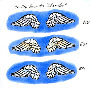
If you look at this collection of wings, you will see how the tone of the wing changes slightly when you pick a neutral color (N2) versus the warm color (E31) or the cool tone (B41). Some birds turn kind of yellowish on their undersides, so you may consider tinting a warm tone with yellow to pick up these subtleties.

Colors around an object will also influence what tone it should be. On my final image today of an egret, the pure white bird is standing on a log in a pond. Since the water is reflective and blue, the white egret will pick up cool tones from the water. If he were standing on a sandy area he might pick up subtle tints from the sand. If he had nothing around him, then his shadows might be a true neutral gray.

Putting a background behind something white helps it stand out more against the white of the paper. These wings look very bright because I put a solid blue background behind them. If I left the sky white there would be much less contrast and the white wouldn't be so dynamic.

Individual Feathers
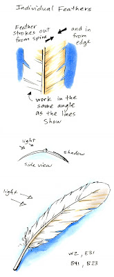
Once you've picked a white tone, let's start coloring by looking at a single feather, since wings are made up of lots of feathers. A bird's feather, or "vane", is made up of lots of tiny rows of little "barbs" that grow out from the shaft. These grow at an angle that points towards the tip. Near the base of the vane are the "downy barbs" . The downy barbs are soft and don't reflect back light. The other barbs however, interlock to form a smooth, shiny vane which does reflect back light.

The feather curves slightly down from the shaft on either side, so you will get one side of a feather in shadow. When you are coloring something white your goal is to accent the shadows without losing the overall whiteness of the object. I strongly suggest that you start with light colors (colors that end in 0, 1, or maybe 2). Go sparingly with darker colors, using them only to accent the deepest shadow areas.

To accent the shadows it is best if you use the brush tip of your marker and work in strokes out from the spine of the feather, following the directions of the barbs. Work from the far edge in and from the spine out. This leaves a natural looking white in between the two colored edges, with color feathering in to the highlight area.

As a feather gets old or the barbs stop sticking together then you see the breaks in the edge. These will also catch the light at a slightly different angle and reflect it back. As you color, your strokes will accent these breaks and the subtle shadows they create.

Coloring a Wing
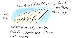
When you put the individual feathers together they overlap to form a solid wing. However, each feather has a slight curve and where two feathers overlap it creates a slight dip in the smooth surface.

Your goal is to accent the overlap and the shadows without losing the white. Again, work with light colors and practice lifting up at the end of your brush stroke. Make your strokes starting from the deepest shadow and feathering out to the light areas. Keep them consistent with the angle of the feathers.

If you are using a Copic original marker you can simulate the "lift" at the end by lifting up as much as possible at the end of your stroke, then coming back with a colorless blender from the opposite direction. This is also useful if you got your colors too dark. Go back from the opposite direction with the blender and push the extra dye into the shadows. On thin paper you can remove excess color by keeping a napkin or paper-towel under your work and it will help soak up extra dye.

For my final image today I drew this egret preening his wing on a log. My scanner did not pick up the subtle colors as much as I would like (the soft blue sky goes half-way up the picture and you can actually see where I made blue-gray strokes between feathers). However, you get the idea of how I use the subtle blues and grays to accent the shadows of white on his underside and where his feathers meet.

On another note, the background plants were colored first with the W2, E31, and G82. Then I added the B41 of the sky over the whole area back there. This washed the colors together and faded them in a more natural way to show the atmosphere and to tone them down, as I talked about in an earlier post.

All images today were stamped or drawn onto Gina K Pure Luxury 120 lb cardstock. Stamped images were stamped with Memento ink and drawn images were made with a 0.1 mm Multiliner SP.

Monday, February 2, 2009

Coloring Eyes part 2 - Realistic Eyes

Here is a step-by-step technique for coloring realistic looking eyes that look great. I'm labeling it advanced, mostly because many of you won't ever need to get this in-depth into coloring and shading an eye. However, this builds upon a post on coloring eyes I made way back in July. There are a lot of my older posts that I have more to add to, so I'm going to make it a goal to finish up my earlier posts. I have a simple adaptation at the end of the post, so keep reading even if you don't think this applies to you.

Before I get into today's technique though, I just want to let you know that the Certification class in Pensacola and the class in New Orleans in a few weeks are now open to the public. Anyone who would like to attend should call Kris at 866-662-6742

Coloring realistic shaped eyes
You need to read this earlier post on understanding manga eyes before we adapt the same technique to realistic eyes. The concepts are exactly the same, only the shape has changed.

If you look at my diagram, you will see how light hits the eye and causes reflections. The reflections change shape depending on what light hits them. In a room with long flourescent lights the shape of the top glint will actually be more square or rectangular.

Always keep in mind where the light is coming from when you put it in. Also, as you turn your head the glint of light stays in the same place.The hardest part is figuring out how much /how little dark to add and where to consistently place your highlight. As with many things in art, this is a matter of personal taste as much as it is a trick in observation.

On this diagram I start with the gray shadow first. On my other post I add the shadow last. It really doesn't matter, as long as you add the shadow sometime.

Add the light blue, BG01 then layer in the BGo5 and BG09. Notice how I'm coloring the edges of the shape darker as well as the top. This helps accent the fact that your eyes are round. I could also add subtle shadows around the corners of the eyes to really make the white look rounded.

Next, I go back over the whole area with my lightest blue, BG01. This will darken that bottom highlight, so I came back in with a hint of colorless blender to lighten up the bottom color.

Right now the eye looks very believably colored, but it still is missing the last few touches that will finish it up to look shiny, reflective, and natural.

Again, for this last step keep in mind where your light is coming from (the highlight goes on the side closest to the light source) and the shape of the light. If you need some good ideas I strongly suggest going and running a search online to look at the shape of light in eyes.

First, I add some deeper color lines into the iris with my darkest blue, BG09. I keep these radiating out from the center. Then I drew in a few small black lines in the deepest color areas to also accent the iris. Last I go back in with my Opaque white paint and add the final highlights. Don't go overboard on the glints! You can always make it bigger, but it's much harder to make them smaller. Subtle is usually enough. You can also thin down the Opaque white so you can see through it, then add this as your very soft light glint.

On my final illustration of this woman you see that the glint of light in each eye is strongest on the same side that she has the strongest highlights in her hair. The reflection in the far eye is smaller because that eye is farther from the light source.

Remember, this is a matter of personal taste, since my illustration is stylized. I could have gotten away with making the other glint larger, and in hindsight, I think I made her lips a little too off-center with her nose. Oh well, it gives me an excuse to draw more pictures. Looking at photos or your own reflection will be the best way to get the glints correct in relation to the lighting and shadows.

Cute and Innocent eyes
Unrelated to the realistic eyes, here are a couple of sea-turtle babies I drew. The eyes really make this image cute, since they are so big when compared to the rest of the turtle. Obviously, these are supposed to be cute and innocent.

I followed the same steps in coloring the eyes by making the colored area lighter at the bottom, darker at the top, and added two glints of light with opaque white last. These really help to accent the cuteness and innocence of the turtles. Notice how luminous and reflective their eyes look. It's amazing what a couple of flecks of white can do to really make a cute picture cuter.

Green turtle: BG01, G05, G85, G29, Eyes BG01, BV13. Purple: Turtle BG01, BV00, BV13, G85 Eyes BG01, BV13. Sand: YR31, Y28, N3, Blender

Sunday, February 1, 2009

Drip Doodle

I looked at my header and realized that it hasn't changed since fall. Time to put something new up! The new header is very simple but it's a style that looks very different than what you're used to seeing from me. Today I'll talk about the process I used to color it.

My new header was drawn very loosely with a Sky Blue Multiliner SP 0.3 mm pen. I wanted this to look fun and whimsical, so I kept it very simple and fun. Then I scribbled in some light blue, B32 for the sky, added YR31 to the stars, and dripped on some colorless blender. Last I added some BV00 for accent color. The whole process, start to finish took maybe 20 min. I didn't scan in the steps, so I'll walk you through the same process on a different image.

Here I'm using the stamp Tree-Mendous Love by Our Craft Lounge. I stamped with Memento Tuxedo black ink. and let it dry longer than usual. This process uses a lot of colorless blender and I want to be sure that my stamp line is good and dry so it won't bleed. Then, I added a simple sky in BG01 and colored the trunk in YR31. Notice that I'm not too careful about keeping the sky smooth. I'm going to be doodling and dripping all over this area so I don't need to be picky.

Next, I drip on colorless blender. To get the best control, I'm dipping the brush end of my sketch blender directly into my large bottle of blender and carefully adding the solution in dabs. I started with the tree branches then dabbed out the color from the trunk. This gives me my big, main "pools" of color that halo the tree. After those dried, I added more drips all over the image to give a second layer of drip, so the drips overlap and look cool.

Once this was dry I colored a few of the "leaves" with the YR31 and some BV13 to give nice contrast.

You could leave your project at this step, but I wanted to do more to it. Here is where the doodling comes in. The shape that keeps getting repeated in this image is the circle. Circles in the leaves and circles from the drips. The tree also has a repeating heart shape, so I could have accented that through repeating heart patterns. The choice is yours. I'm going with dots & circles though, since they are simple and go along with the doodling from last week.

With my BV13 I doodled half-circles with only dots. See how these little doodles add to the overall circle effect? I added larger dots of the YR31 to carry the tree-trunk color throughout the whole image. Now my tree looks very interesting. It's loosely doodled making it unique, but it has cohesion through the repeated circle motif.

On my new rocket header it's hard to see the repeated dots, since I drew them with the YR31. Part of doodling is figuring out which elements are most important and should have more contrast. On the rocket, I didn't want the dots to overwhelm the image, so I drew them very light. The tree is very clean and graphic, so I wanted something dark to break up the smooth look of the image.

I challenge you to step out of your comfort zone and color something totally differently than you normally would. In this case, using only 3 colors and the repeating circles the image ties together well even though it also looks random. What can you do to alter an image or create a self-doodled background? I hope this gave you some ideas, have a creative week!